This portfolio
The visual system behind this site, and how I produced it working with AI.
I started by loading ten years of work: seven projects, notes, deliverables, and everything I could remember about each one. From there, AI helped me organize the content, turn a moodboard into a visual guide, and produce the whole site, including the case study imagery. Below is the system that came out of it, running on this very page, along with the decisions where the judgment had to be mine.
How it was made
There was a UX process behind this, with its content and its architecture, but that isn't what this page is here to show. In five steps:
01
Moodboard
References until the direction was clear: editorial, near-monochrome, no ornament.
02
Brief
What it had to communicate and what it shouldn't. Written before asking anyone for anything.
03
Visual guide
Produced from that brief and adjusted over several rounds until it closed.
04
Build
20 pages in HTML and CSS, no framework and no build step.
05
Audit
Contrast measured, focus visible, reduced motion respected.
How I worked with AI
Three tools with separate jobs. ChatGPT to organize the content, define the structure, and prepare the prompts. Claude for the visual guide and the case study imagery. Claude Code to build the site, write the HTML and CSS, and carry the iterations that are still going.
No request was an open conversation. They all carried the same structure.
Context
What the site is, who it speaks to, and where we are.
Inputs
The full visual guide, attached. Never summarized: if the standard doesn't travel with the request, you can't hold anyone to it.
Task
One thing, scoped to a single page or a single piece.
Format
Exactly what to return: complete HTML, or an image at defined proportions.
What not to do
Don't change the styles. Don't reinterpret the guide. Don't invent data.
The only thing that changed between requests was the task. The last part prevented more problems than the other four combined.
Decision — the limit goes inside the prompt
I asked for
Connecting several loose HTML pages and unifying components, responsive, and accessibility.
I got back
A connected site, with normalized components and the visual direction intact.
I decided
To write into the same request: "no significant visual changes; it must stay aligned with the current style guide." An integration pass is exactly when an AI redesigns while improving, and fixing that afterward costs more than the inconsistencies it came to solve.
The starting point
Six references and one instruction: "I'm going to share some references of what I'm after; based on them, develop two proposals." No brief and no adjectives, so I could see what the AI read in them before colouring it with my own words. The six didn't agree with each other, which is exactly where the decision shows up.
Chosen
Editorial monochrome
Condensed uppercase display, body in Inter, a single warm accent.
Discarded
Warm studio
Italic serif, beige and warm grey with a muted green, large portrait.
I picked the first, and with it I lost the warmer direction. That warmth had to come back some other way, and it came back through the background: bone instead of pure white.
From reference to system
To warm charcoal. Absolute black vibrates in long text.
To muted clay. The original competed with the content at every link.
A reference gets looked at for a few seconds; a palette has to survive twenty minutes of reading.
Color
Six tokens with one job each. If a color doesn't have something specific to do, it isn't used.
Each accent has two versions, one to fill with and one to write on. Pure clay gives 3.47:1, enough for a button and not for text, so dark clay exists at 5.68:1.
Decision — measure instead of look
I asked for
A warm grey for metadata and captions, consistent with the palette.
I got back
#8a8474. It looked right on the bone background.
I decided
To measure it: 3.5:1, and WCAG AA requires 4.5:1. I swapped it for #787160, which gives 4.58:1 at the same temperature. Three characters, and you can't see the difference unless you measure it.
Typography
Two families. Condensed uppercase Oswald only for the project name and the process labels; Inter for absolutely everything else. The full scale, rendered:
Coca-Cola FEMSA
Oswald 600
clamp(26–44px) · 1.1
Project context
Inter 600
30px · 1.25
Understanding the data context
Inter 600
21px
Key decisions
Inter 600
17px
Body copy is capped at 680 px, about 78 characters per line. The container reaches 1120, but running text never does.
Inter 400
16px · 1.65 · max 680px
Supporting text inside cards and lists.
Inter 400
14px
Captions explain why an artifact matters, not what it is.
Inter 400 italic
13px
Section label
Inter 600
11px · 0.04em
The rule that holds the system together is where the display face isn't used. A condensed uppercase repeated at every subheading competes with the content and wrecks scanning.
Decision — making it walk that back
I asked for
A rewrite of the guide folding in my professional context.
I got back
A change of direction: it dropped the condensed display from the moodboard and proposed an editorial serif, because Oswald sounded to it like "loud branding".
I decided
To reverse it: "I'd rather keep the large-headline style with typefaces like Anton / Oswald, since I want the design to reflect my UI knowledge and visual judgment too." It assumed I had to choose between looking strategic and looking like a designer. The guide was rewritten, and that's why the site looks the way it does.
Vertical rhythm
There's no regular spacing scale. There's a grouping rule: the space inside is always smaller than the space outside, which is what makes an image and its caption read as one thing.
72 / 44 px
44 / 30 px
14 / 10 px
On mobile everything compresses, but the proportion holds: 14 and 44 become 10 and 30. Scaling everything equally would have broken the grouping exactly where it's needed most.
Components
These aren't screenshots: they're the site's real components, running here with the same CSS the seven case studies use.
Buttons
Badges and tags
Process pills
Snapshot card
Industry
Banking / Investment products
Impact card
Business value
Three dashboards tailored to each level of decision-making.
Problem statement
Problem statement
How might we help users navigate complex data?
AI callout — sage, in its one permitted use
How I used AI
I used AI to organize stakeholder inputs and explore ways to structure the information. Final decisions stayed mine, grounded in UX criteria and client feedback.
Before / after — equal visual weight on both sides, so the reading isn't biased
Before
Open-ended inputs that produced failed responses.
After
Structured paths with predictable outcomes.
Testimonial
Stephanie sorts out ambiguity before it turns into a development problem.
Structure example · the real quotes live in each case study
Sage appears in exactly one component across the whole system. Repeating the same formula in all seven cases turns "I use AI" into a recognizable pattern instead of a loose claim.
Accessibility
AI creates visually convincing interfaces that aren't necessarily usable. Everything explained below can be validated directly on this page.
Visible focus
One rule for the whole site: a 2px clay outline, offset 3px from the element. Press Tab and it appears.
Press Tab until you land here. The outline shows for keyboard, not for the mouse.
Clay gives 3.47:1 on bone and WCAG asks for 3:1 on focus indicators. It passes with little margin, and the margin matters: if I ever darken the background, that outline is the first thing to stop qualifying.
What else is handled
- A skip link, hidden off-screen, that appears when it receives focus.
- If the system asks for reduced motion, the loader doesn't exist and transitions drop to 0.01 ms.
- All 94 images carry alt text describing what the artifact shows, not "image of".
- Text contrast is measured, not estimated. The numbers are further up.
The bug I found by using the site
I opened the home page on my phone, which was in dark mode, and it rendered black. Some mobile browsers invert colors on their own when a document doesn't declare which scheme it uses. One line fixes it, color-scheme: light only, but you have to see it first, and it didn't come from an audit. It came from opening my own site on my own phone.
And what I didn't do
- There's no dark mode, and that's a decision rather than an oversight. The palette is calibrated for long reading on a warm background, and doubling the tokens to invert it would give two mediocre systems instead of one good one.
- The focus outline meets AA with little margin. If I ever take the site to AAA, that's where it starts.
- I didn't run a full screen-reader pass. The HTML is semantic and the landmarks are there, but that's an expectation, not a verification.
The case study imagery
All the images across my seven projects were generated with AI. Almost all my work sits under NDA, and blurring screenshots leaves an image that says nothing. I chose to represent the product rather than cover it, keeping the structure and the design decision without exposing a client data point.
The rule I wrote for this
Blur over sensitive data, never over the whole interface. When blur isn't enough, a simplified representation. And the "Under NDA" badge always in the same place.
The style isn't identical across the seven cases either. Within a project the pieces share a design so they read as one series; between projects it changes on purpose, because they're different products and each has its own accent. What stays fixed is the graphic language.
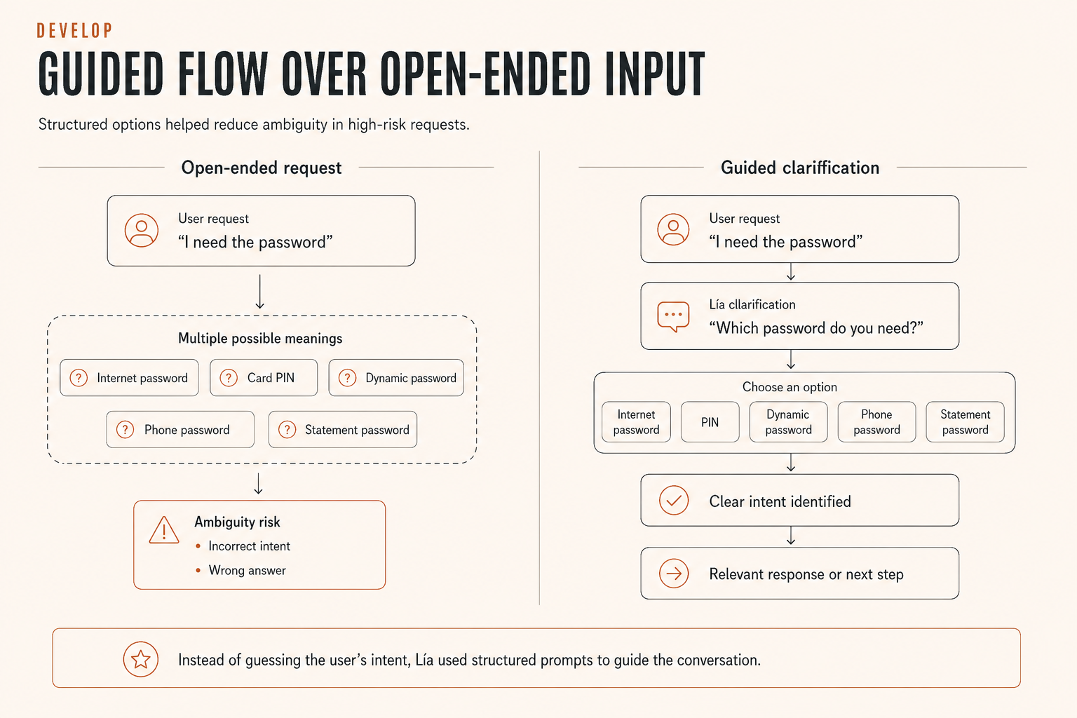
Banco Falabella. Guided flow versus open-ended request. The coral is this project's accent, not the portfolio's.
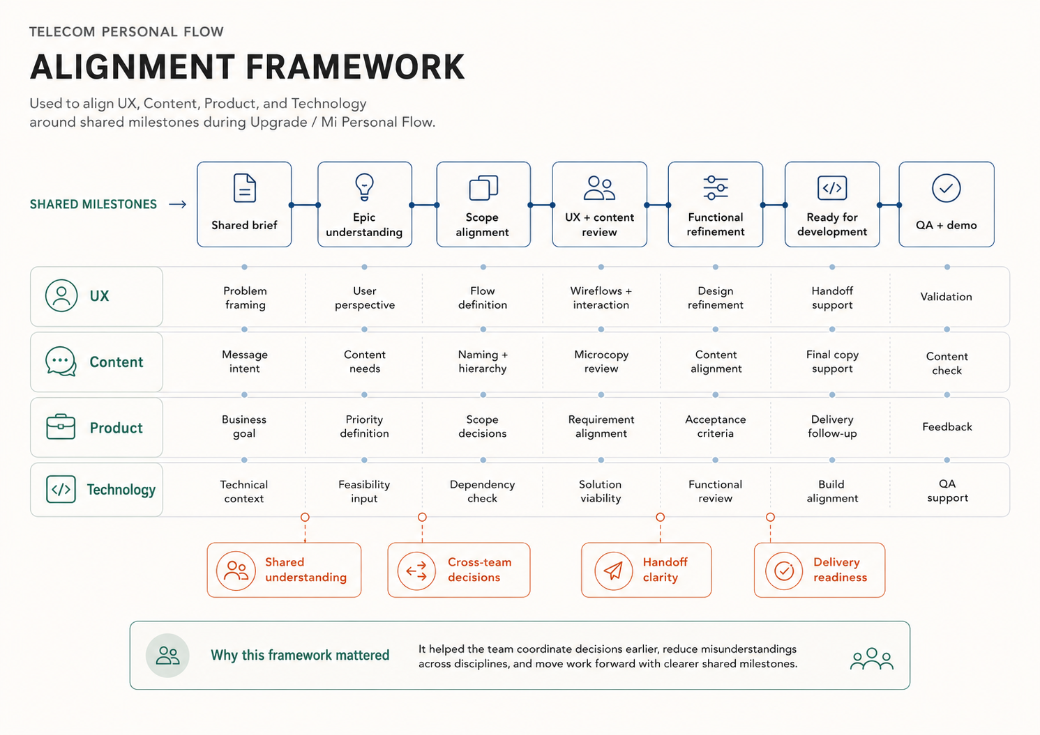
Telecom Personal Flow. A different accent, the same typeface and the same boxes.

Mondelez. Here the color is part of the content, because the case is about data legibility.
Click any of them to see it at full size.
It took work. AI generates each piece separately and doesn't remember the previous ones, so a color turned up outside the palette, a heading came back at a different weight, a box overflowed. I kept sending images back until each belonged to its series.
Decision — audit them all, don't patch one
I asked for
The images for one of the case studies.
I got back
Pieces with an orange accent that doesn't exist in the palette.
I decided
To review all ten in that project, not just the one in front of me. A color outside the system almost never shows up once, and auditing the set costs less than discovering the eleventh in an interview.
The details that close the experience
The last things in, with the content already complete. None of these details helps anyone understand my work, so none of them blocked publishing, but they're what decides whether the site feels finished.
The problem: you tap EN and there's a blank beat before another page arrives.
The language switch
The pill slides in 320 ms while the colors swap, and navigation fires at 280. The page changes while the animation is still running, so the motion covers the load.
The JavaScript intercepts the click so it can animate, but underneath is an ordinary link: if the script doesn't load, switching language still works.
The problem: an intro animation on every visit turns into a toll.
The loader
The initials in Oswald and a hairline that fills with clay: a progress bar at its smallest expression. It shows once per session and by default doesn't exist at all, so there's no flash to cover up.
SC
Stephanie Cacheo
The problem: artifacts carry a lot of detail and can't be read at reading width.
The lightbox
Each image is a button that opens it large, with visible focus, keyboard, and the caption included. The detail is in the scope: moving to the next image only walks through the ones in the same process step, so you never end up in another phase without noticing.
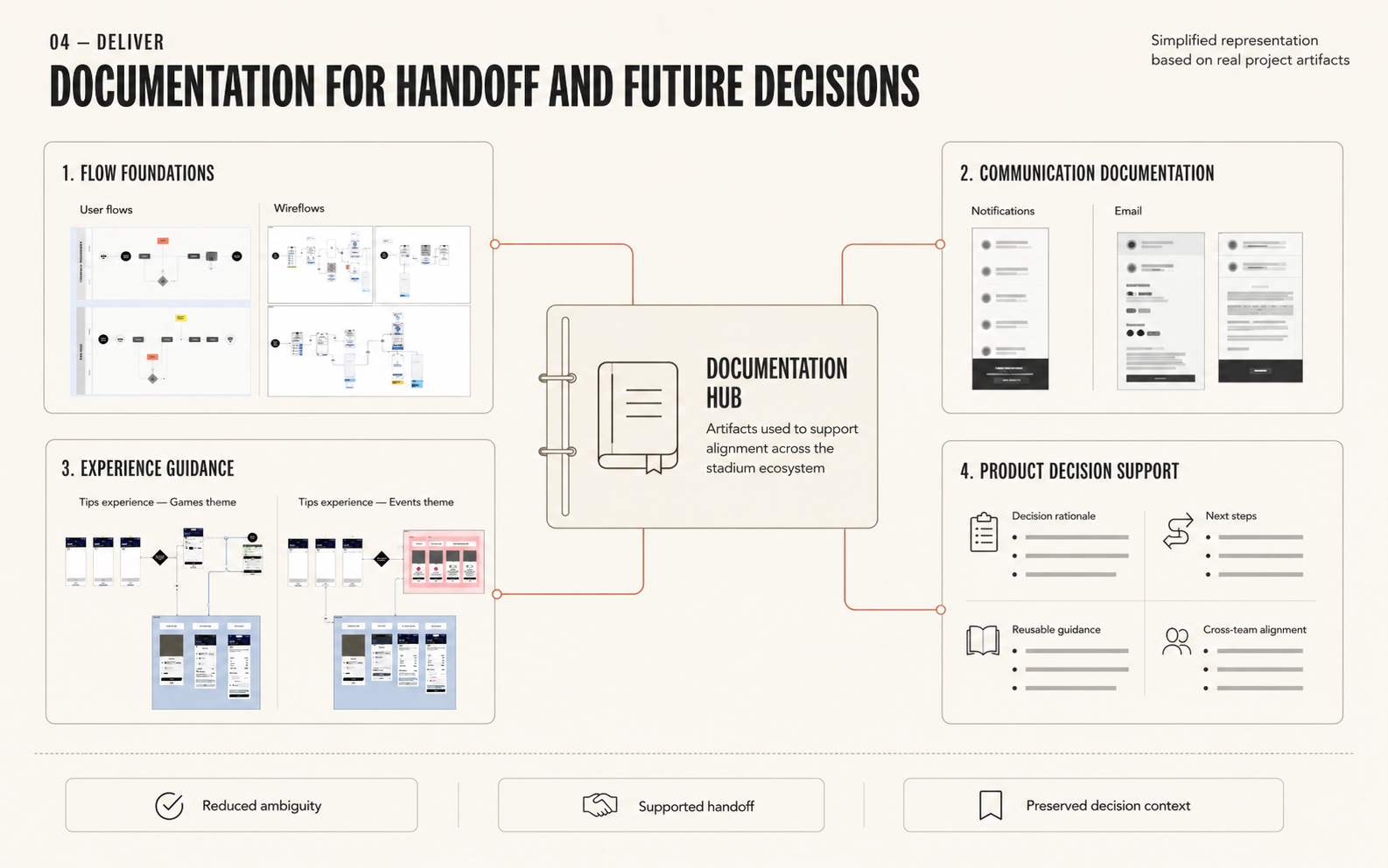
Intuit Dome, at half the width it was designed for. Click to see it as it really is.
The problem: finding my tab among fifteen others.
The favicon
Four sizes, and the one that rules is 16 px. Only two letters with strong contrast survive there, and that decides the design of the other three.
 16 px
16 px 32 px
32 px 180 px
 512 px
This one isn't about using the site, but about what happens when someone pastes the link.
The sharing card
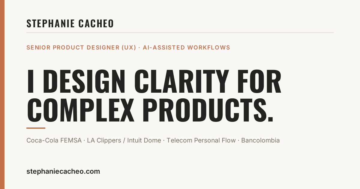
On LinkedIn or in a message, the preview is the first impression and nobody gets to negotiate it. Same system as the rest of the site, with one version per language.
AI didn't supply the ideas or the structure, that part was already there. What it supplied was a way to execute them when I didn't know how. I don't know deploys or infrastructure, and the site is published on Cloudflare all the same. I also wouldn't have reached this level of interface detail, or produced the imagery for seven projects, in the weeks I had.
It's one more tool in my process, and this portfolio is the evidence that I know how to use it. Often the idea and the structure are already clear and what's missing is the route to carry them out. That's where it changes something real.
Stephanie Cacheo — Senior Product Designer / UX Lead